What is changing, and what deserves your attention?
There is a particular danger with a really good mood board: you can fall for the look before you have worked out whether it belongs to the business. That is what makes design trends both exciting and occasionally frustrating. They open up possibilities, but they can also become a shortcut around the thinking.
Adobe’s 2026 creative forecast groups its observations around sensory experience, connection, play and local character. Canva’s 2026 report uses the broader idea of imperfect design, with directions that include texture, more personal expression and deliberate simplicity. These are platform forecasts, rather than rules or proof that every audience wants the same thing.
What excites me is the room for character. A specific photograph, an unusual typographic decision or a colour used with conviction can give a brand something of its own. The directions below are my interpretation of what is useful in the current conversation. I would treat them as things to explore, not a checklist to apply to every project.
01 / Photography that belongs to the business
Give me a real person in a real place over an interchangeable stock image. I want a photograph to reveal something: the conversation around an idea, the concentration in someone’s face or the wall where the work is still being figured out. Those details make a business feel like somewhere people actually belong.
The point is not to make everything look casual. It is to make the images feel true. A carefully directed portrait can have plenty of craft and still feel warm. The useful difference is whether the photograph reveals something about the people, work or setting that another company could not simply borrow.
Plan the shot list around the website rather than a collection of attractive portraits. Leave space for a heading. Capture wider compositions and close details. Think about a mobile crop before the shoot, and give people enough context to be comfortable in front of the camera.
For a client, this is often a more lasting investment than a fashionable graphic effect. A useful image library can improve service pages, recruitment, social posts and sales material while making the whole business feel more connected.
02 / Expressive type, with an organised supporting cast
Typography is often where a design starts to come alive for me. A change of scale or an unexpected face can give a simple sentence real feeling. But the exciting bit is the relationship between the expressive moment and everything around it. A page needs some quiet voices too.
A headline is allowed to have energy. A form label needs to be legible. A menu needs to feel dependable. These jobs are connected, but they are different. Define a hierarchy that gives the expressive type a clear role and lets the everyday information remain easy to use.
Start with the actual language. If a heading needs five forced line breaks to look good, the design may be depending on a specimen rather than a working system. Test the longest service name and the awkward article title before signing off.
For designers, our Google Fonts shortlist is a useful place to explore a different voice. For a business, the more useful question is what the typography communicates: reassuring expertise, lively ambition, careful craft or something else entirely. Choose that intention before choosing the face.
03 / Tactile details that give the eye something to notice
I am drawn to texture when it gives me a sense of the thing itself. A paper edge, the surface of a material or a close detail in a photograph can make a digital page feel less remote. I lose interest when the texture is just an effect sitting on top of an idea that has not quite arrived.
The most convincing textures tend to come from the subject. A food brand has ingredients and surfaces. A construction business has materials, tools and finished spaces. A charity has places, people and objects with stories attached. Looking closely at those things often produces a more meaningful visual language than adding a generic distressed overlay.
Keep text backgrounds calm enough to read. A texture that looks subtle on a large studio monitor can compete with small type on a phone. Compress image assets carefully and avoid loading an enormous decorative file for an effect that contributes very little.
My test is simple: remove the texture and ask what has been lost. If the answer is a useful sense of material, place or personality, it may be worth keeping. If nothing changes except the amount of decoration, the cleaner version may be stronger.
04 / Colour with a clear job to do
I love a bright colour, but I want it to earn its place. Yellow can give a page a lovely burst of energy. Blue can make an action feel clear and immediate. Used everywhere at once, though, they stop helping me know where to look. The restraint around a strong colour is often what makes it work.
Try creating a colour hierarchy before designing every section. Decide what carries long reading, what supports navigation, what gives campaigns their energy and which combinations are reserved for short moments. That makes a website feel considered even when the pages have different content.
Check the actual text and background combinations rather than approving colours in isolation. White on a bright accent may look lively but still be difficult to read. Hover and focus states need the same attention as the default view.
For clients, this is where brand and usability meet. A confident colour system should make the business easier to recognise and the website easier to use. It should not ask visitors to choose between personality and understanding.
05 / Motion that acknowledges the person using the page
A small, well-judged movement makes me smile. A button that responds, an image that shifts gently or a menu that opens with a bit of rhythm can make an interface feel properly considered. I do not need the whole page to keep asking for my attention while I am trying to read it.
Give each animation a reason. It might show that an element is clickable, explain a change of state or connect one part of a journey to the next. If it delays a task or repeatedly pulls attention away from reading, reconsider it.
Design the reduced-motion version at the same time. People should be able to understand the page without movement, and an animation should not be the only signal that something matters. Keyboard users also need a clear focus state rather than a hover effect they cannot trigger.
A practical approach is to choose a small shared set of behaviours for buttons, links, cards and navigation. Repeating those behaviours gives the site a recognisable rhythm. Adding a different animation to every section usually makes it feel less coherent, even when each effect is impressive on its own.
06 / Local character without the local cliché
Local character interests me when it is specific. The people, the studio, the language and the little details can say much more than a landmark photograph. I want to get a feel for a business, not just be reminded which county it is in.
For a West Sussex agency, showing the studio and the people who work here says more than dropping a county name into every heading. A location should help a visitor understand where the business is and what working with it might feel like. It should not limit the ambition of the work.
Designers can look for those details during discovery. What do people keep on the studio wall? Which expressions come up in conversation? What is distinctive about the setting? Specific observations often lead to a stronger identity than starting with a broad visual label such as friendly or premium.
The important part is permission and accuracy. Use real stories and approved photography. Do not manufacture a heritage, community connection or client experience to make the brand feel more interesting.
A useful way to decide what to adopt
Choose one direction and test it on a small, meaningful part of the customer journey. That might be a campaign landing page, a recruitment story or a refreshed article template. Define what you want to improve before changing the design: clearer navigation, a more recognisable voice or a stronger reason to enquire.
Then look at the whole experience. A playful header cannot carry a confusing form. Beautiful typography cannot rescue a vague proposition. The most persuasive design trends are useful because they help a brand express something it already has a reason to say.
If I had to choose one thing to carry forward, it would be specificity. Find the visual detail that belongs to the business and give it the attention it deserves. That is much more exciting to me than a website that looks impressively current but could belong to almost anyone.
Sources & further reading
Primary references checked on 17 October 2026. Recommendations and visual explorations are our own.
Something you are exploring?
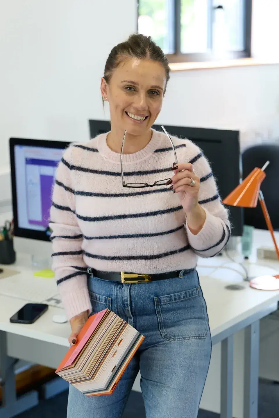
If this has sparked an idea, or you are wrestling with a design decision, I would love to hear about it. Tell us what you are working on and ask for me.
Ask Laura a question ↗Explore brand & creative ↗