A clear identity.
Out in the world.
A brand identity carried through marketing materials and vehicle livery, giving DART a consistent presence wherever people encounter the business.
A clear identity.
Built for everyday use.
A company’s identity has to earn its place in the working day. It needs to look right on a piece of marketing, hold together on a vehicle and be recognisable at a glance. For DART, our brief brought those practical demands together with the opportunity to give the business a clear visual character.
We worked across brand identity design, marketing collateral and vehicle livery. The aim was to create a consistent way for DART to introduce itself, with an identity that works beyond the first presentation and into the places customers actually see it.
A clear mark.
A recognisable name.
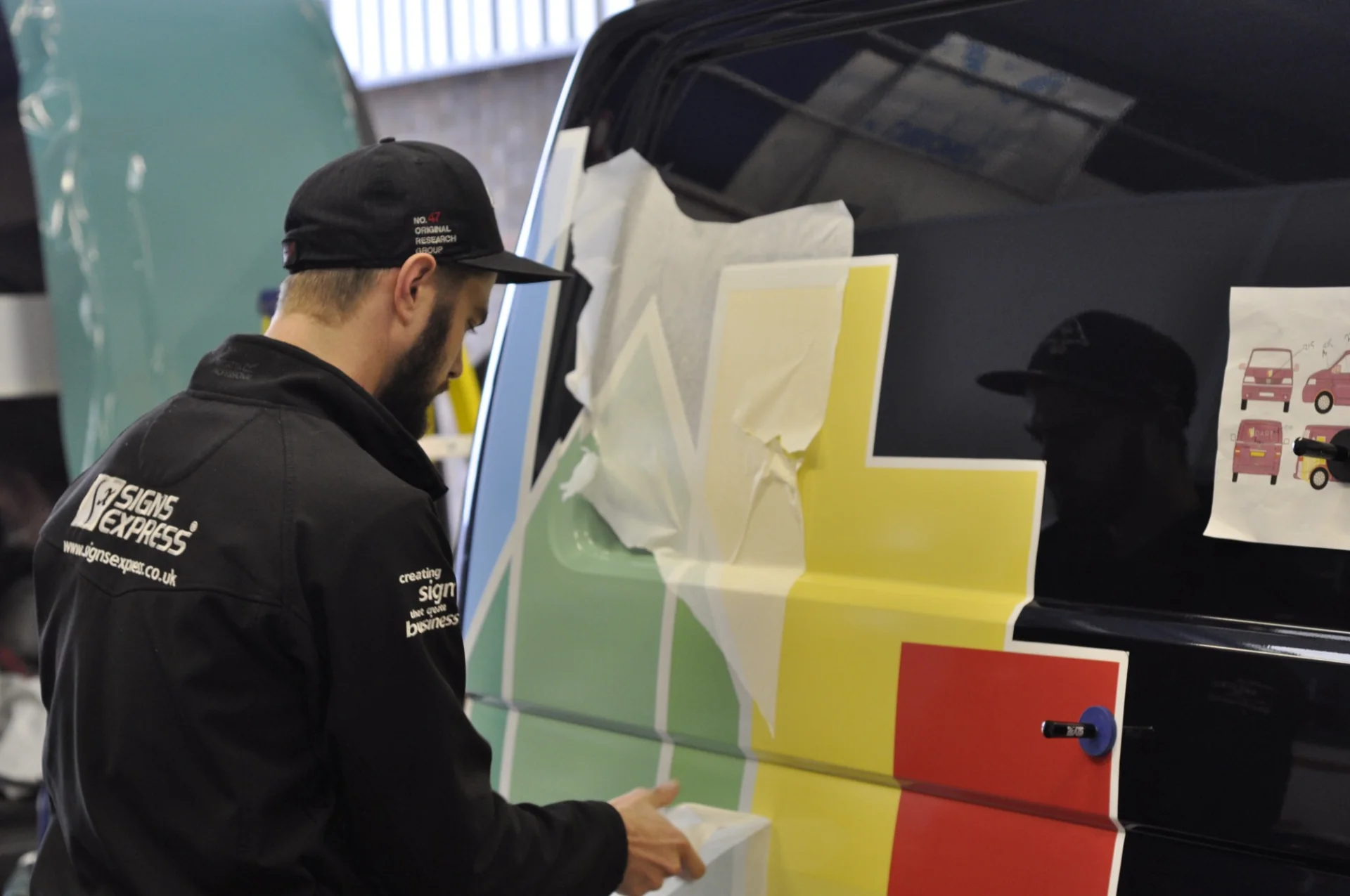
We designed DART’s logo to give the business a distinctive identity, with a colourful architectural symbol and a clear wordmark. From marketing collateral to vehicle livery, it gives every application a recognisable starting point.
From the drawing board.
Onto the van.
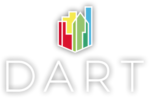
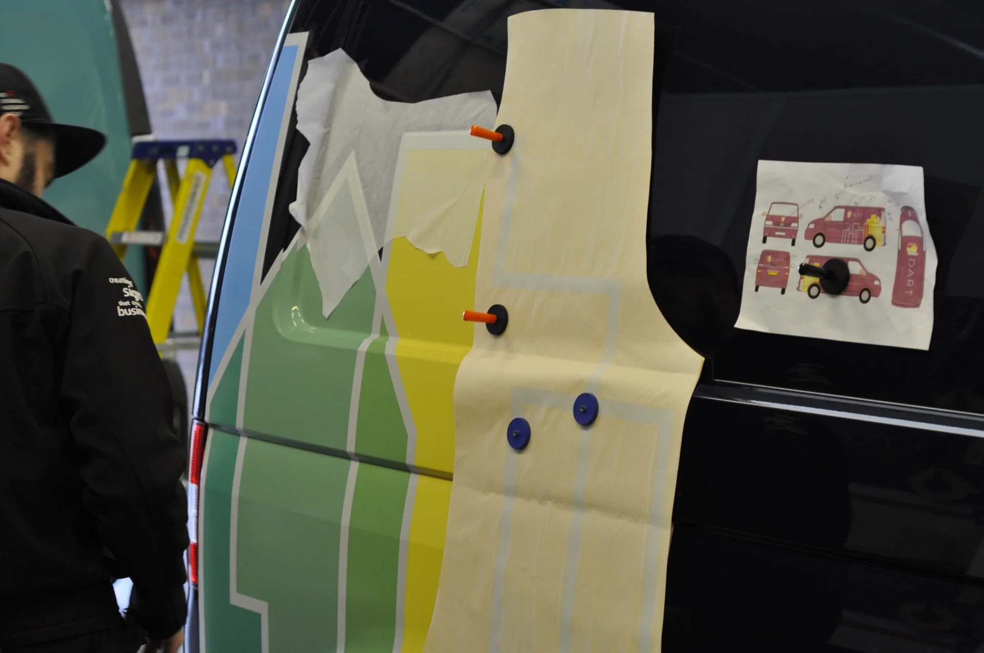
Our logo and brand identity take shape on DART’s vehicle livery. These photographs show the graphics being applied, bringing the design into everyday use.
The brief.
The work.
The thinking.
Brand identity design
We developed a brand identity with its real-world applications in mind. A good identity should give a business character without making it difficult to use. We focused on a clear visual direction that could hold together across DART’s materials and present the company with confidence.
Marketing collateral
The identity then needed to work in the business’s marketing. We designed collateral that brought the brand into practical use, keeping the information clear and the presentation consistent. Each piece gives DART another opportunity to make a recognisable, professional impression.
Vehicle livery design
Vehicle livery asks different things of a design. People may see it from a distance or only for a moment. We translated the identity into a format suited to that setting, with the emphasis on recognition and legibility rather than simply filling the available space.
Designed as a brand.
Used as a business.
We considered the identity and its applications together. That helped keep the work grounded in the places it would appear, rather than treating the collateral and livery as an afterthought.
The details matter: how the design changes scale, where the information sits and what someone notices first. Getting those decisions right makes the identity more useful across the business.
More places to be seen.
DART has a coordinated visual identity across its marketing materials and vehicle livery. The different applications share the same character, helping the company present itself consistently in print and out on the road.
The value of the work is practical as well as visual. It gives the business an identity it can put to use, with materials that feel connected and a clearer presence wherever customers come across it.
Your next
chapter?
Perhaps you’ve got a similar challenge. Perhaps you’re thinking, “We could do with a bit of that.” Either way, we’d like to hear about it.
Tell us what you’re thinkingA conversation is a good place to start.