Although packaging originated many centuries ago, designs are becoming more and more extravagant. These designs can influence whether or not consumers wish to make the purchase, so they are incredibly important to brands. We live in a consumer culture and the image of the product is as important as the product itself. Therefore, we’ve compiled a list of our 4 favourite packaging designs from around the world that we think have enough power to influence the modern consumer.
Loving Earth
The Australian food company have a unique range of products, from chocolates, cereals, snacks, butters and spreads. Their products are made from high quality, organic and fairtrade ingredients. They also have a genuine passion for environmental sustainability and individual well-being, which is expressed throughout their whole brand personality. They rebranded their raw chocolate packaging to new vibrant contemporary colours, differentiating the flavours from one another. This refreshing look fits perfectly with their earthly brand to attract the their modern forward-thinking consumers, with gluten, grain, dairy and sugar-free versions, this product is very much a modern consumer’s dream.

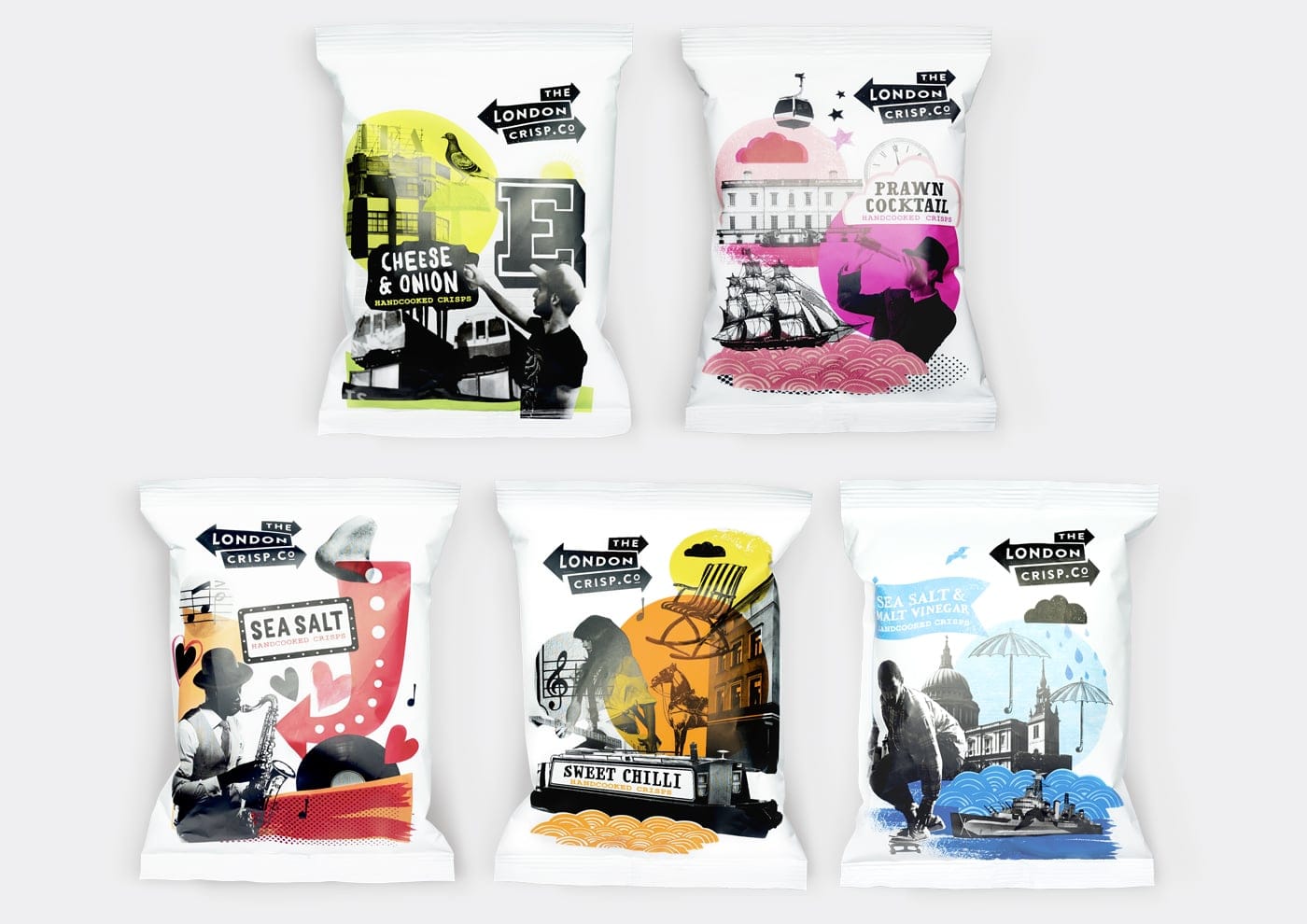
The London Crisp Co.
Founded in 2015, this crisp company has been fully inspired by the eccentric and diverse parts of London, with each pack dedicated to a certain area, they were fully committed to creating a package design that would show off their heritage. Their range of five different flavours all have a different design, with a collection of contrasting typography, images and illustration to represent the ever-changing landscape of London as well as the cultural history.

Nongfu Spring Mineral Water
The hugely popular Chinese beverage company wanted to redesign their water bottles and packaging to engage the youth market. In order to do this they designed a series of four different bottles, incorporating the different seasons of the year, with different regions of the spring in which they source their water, the Moya Spring. It was illustrated by designer Brett Ryder, who combined the anthropomorphisation of animals to create a storybook-like design.

Neat Confections
San Pedro based pastry company have a range of biscuits and cakes, specifically created to accompany tea or wine. Sourced with organic ingredients such as spices and fruits, they create a unique experience of confectionary for all occasions. The inspiration for the packaging design came from the theme of perfection and craft that comes from the brands values and personality. The design itself is a simple mirrored box with a white and pastel wrap-around, with a range of colours for the different flavours, it is a unique style of packaging for confectionary, compared to others in the same market.
