This year has been an interesting and important year in the design industry. It has seen re-brands for some of the worlds largest companies, new technology developed and innovative ideas and concepts come to life.
Possibly the biggest branding project of the year has to be the new look from Google. Based on their previous brand journey, the Google in house team have refreshed and updated the logo, given Google+ a ‘drastically simplified’ overhaul, rebranded Google ventures and replaced Google Inc. with a new public trade identity ‘Alphabet’. The new logo features a more playful typeface and a new ‘G’ icon alongside four coloured dots all designed with motion and scalability in mind, which I’m sure are factors that will be of growing importance in the future.
Channel 4 have had a major rebrand as well this year, led by their in-house consultancy 4Creative. It includes fun, extensive animation work around the deconstructed ‘4’ as well two new typefaces by Neville Brody. Other notable rebrands this year include Spotify, RBS, Freeview, Carlsberg and Facebook.

2015 has had it’s fair share of controversy, from rumours of a possible £3billion redesign for the Parliament buildings interior, to the Tokyo 2020 logo getting pulled due to plagiarism claims. On this note, the year has also seen some significant design competitions, with the Olympics logo opened up to ideas from the Japanese public and the New Zealand national flag being re-designed following a nationwide public ballot, which attracted over 10,000 entries.
Over the year 3D printing has continued to revolutionise the product design industry and stay in the news headlines. The potential for this technology to change the world is massive – from the awaited release of the first commercially available printed car next year, to artificial hair and wheelchairs for dogs, it is something that we simply can’t ignore. It is also starting to have an impact on the world of medicine, with an affordable printed bionic hand winning this years UK James Dyson award.
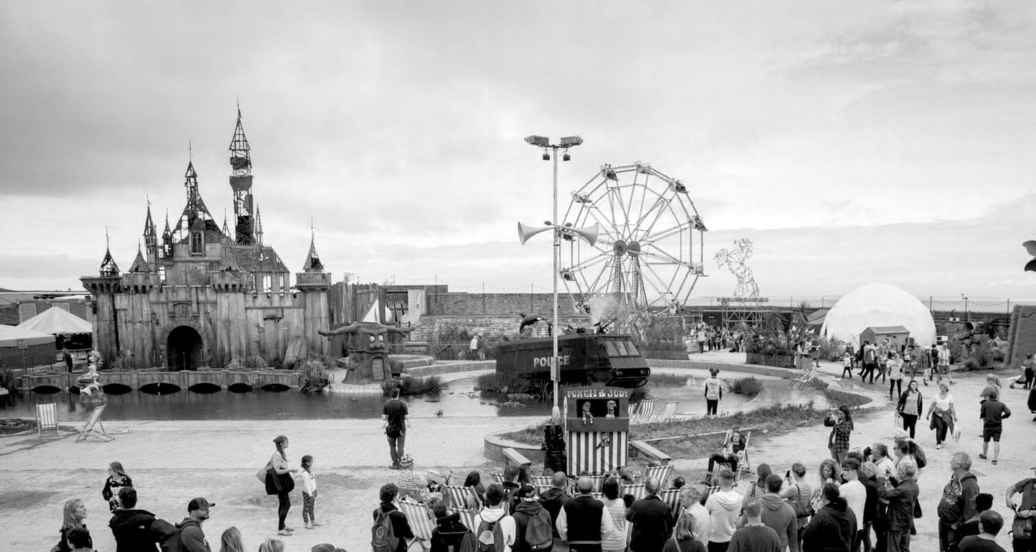
Banksy’s pop up ‘bemusement park’ Dismaland, was probably the most influential and controversial art exhibition in the UK this year. Open to the public for five weeks in Weston-Super-Mare, it featured a dilapidated fairy castle, a distorted mermaid and a pond of migrant-filled boats amongst other politically focused pieces of art. Many of the works involved audience participation, and the park hosted a masked ball with live music artists.
One of the stand out campaigns of the year was several large brands and organisations dropping letters ‘A’, ‘O’ and ‘B’ from their logos in June, for the #Missingtype NHS campaign. Designed to encourage people to give blood, big names such as Odeon, Waterstones, Daily Mirror and Transport for London took part alongside several others, as part of National Blood Week.

In the last couple of months we have all enjoyed viewing/critiquing/giving our opinions on the now-expected Christmas television ad campaigns. With the usual John Lewis and Sainsbury’s front runners reaching over 20 million views each, Aldi’s controversial take on John Lewis’s ‘Man on the Moon’ has also proved extremely successful, if a little cheeky.
2016 is set to be another great year in terms of design and we can’t wait to see what it has in store!