Having a well designed and considered logo is one of the most important foundations for an excellent brand. The logo is often the first element that a potential customer or client will see, so creating a relevant and attractive first impression is crucial.
Even an untrained eye can quickly spot the difference between a homemade clip art-esque five minute job that somebody has knocked up on a 1994 edition of Microsoft Paint and a professional, well thought out logo backed up by a solid brand. Depending on this, it could gain you a sale, or push away a potential life-long customer who hasn’t even got as far as giving your product or service a chance.

Whilst I am a firm believer that design should not necessarily follow a set formula or structure, there are definitely a few questions that I think are important to consider when creating a new logo for your brand:
Does the concept properly represent your brand?
Your logo needs to reflect what you are about and who you are in a snapshot. It’s good to start with who your target audience are, which market your business is involved in (e.g. an illustrated festival logo should look different to a corporate law firm) and what your competitors are doing.
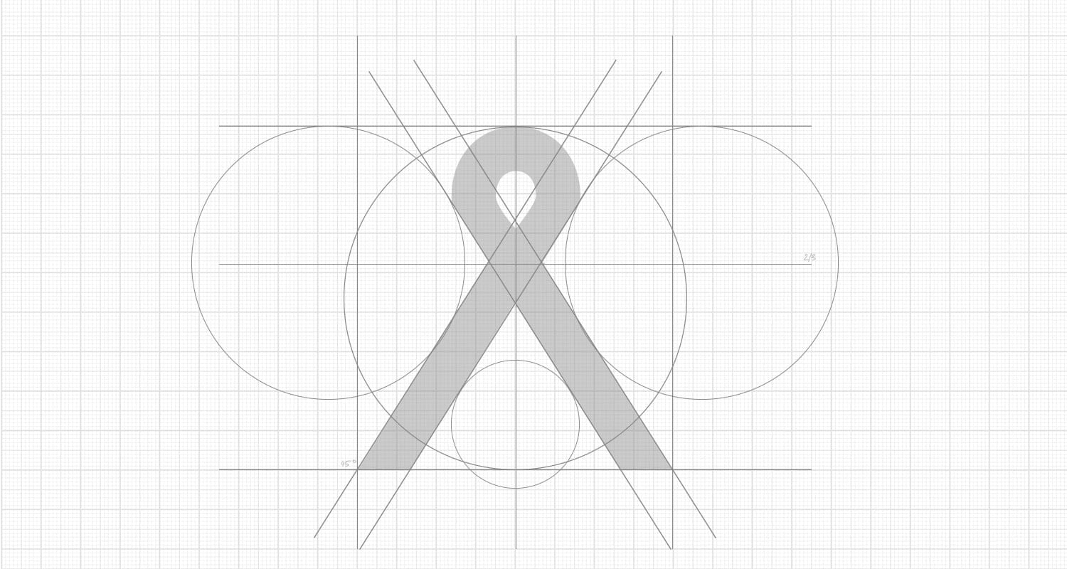
Is it unique? Does it stand out from the competition?
In a world where design is developing so quickly, it can be difficult to think of a unique idea. I find that when I put time to really research the industry and create mood boards for inspiration, that is when the ideas start flowing and unique brands are developed. A hidden graphic message in a logo (FedEx, Toyota, Toblerone etc.) is a great way of generating interest and getting people talking about your logo, but only works if the right idea is there.
Is it legible and easy to understand?
With a logo, clarity is everything. The last thing that you want is for people to perceive your logo as unclear or unreadable from a distance. It’s good to aim for something that people will recognise at a glance.
What logo elements are needed?
Generally, I enjoy designing logos which feature an icon that can be used with type or stand alone as it brings another element to a brand, this isn’t to say that it’s appropriate for everyone though. Also a lot of typographic logos don’t need an icon – think Coca-Cola and Google! Strap lines and established dates when used in the right places, can also help to build trust and explain your brand.
Will it stand the test of time?
Will your logo look dated and irrelevant in five years time? Whilst it’s tempting to follow design trends (and not always a bad thing), longevity is worth considering. Brand logos can be refreshed from time to time, but it is important to have a strong initial base logo to work from. Take Nike for example… though the colours and styles have changed surrounding it, the simplicity and boldness of the swoosh icon remains recognisable and timeless.
Will it work across all media platforms?
On a more practical note, where will your logo be used? Will it work on a billboard and also on a business card or email signature? It’s worth considering a horizontal and stacked version where necessary.
Simply, a great logo needs a lot of consideration as it is the very starting point of your brand – it’s something that you need to spend time on to get right, as it might stick with you for years to come.