As with any major rebrand that involves such radical change, this move has been met with mixed reaction within the digital community.
Instagram took to their blog to announce the news and to quote their post, the icon is ‘Inspired by the previous app icon, represents a simpler camera and the rainbow lives on in gradient form’.
https://vimeo.com/166138104
Focussing on content
Whilst the new icon dropped the previously muted colour palette and became bright and colourful, Instagram have decided to take the opposite approach for the app interface, introducing a clean, vastly monochrome UI which they say helps people’s posts remain the focus of the app.
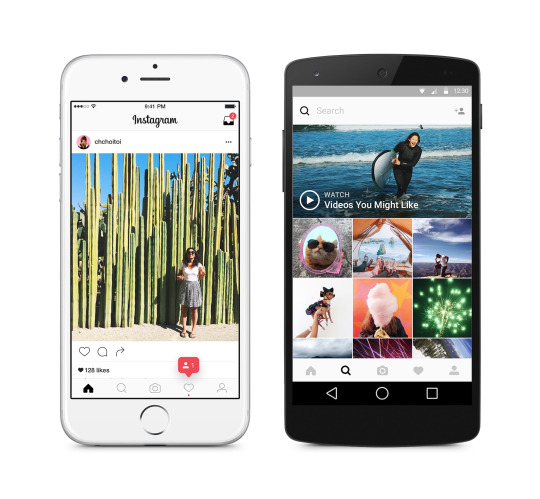
“We’ve made improvements to how the Instagram app looks on the inside as well. The simpler design puts more focus on your photos and videos without changing how you navigate the app.”
As mentioned previously the reaction within the community has been rife with opinions on the new icon, both positive and negative. Whilst I admit my own opinion was at first mixed, I find it hard to accept when other designers are so publicly negative. Especially when I imagine the majority will most likely have no idea of the pressures of actually going about a project of this size under so much scrutiny; or the huge amount of work and consideration that must have gone into it by a whole team of people. Anyone can take to Dribbble and post their take on what brands ‘should have done’, ‘just for fun’ without too much comeback.
[callout title=”Want to know more about our website design service?” body=”Grow your business with a beautifully-designed website that showcases your work, builds your brand and sells your offering to the right audience.” href=”/services/website-design” button=”Find out more”]
That said part of me did share the opinion of designer Michael Flarup who posted his interpretation on Dribbble saying he wished there’d been more of a fusion between aspects of the new icon and the character of the old one. However I do believe the actual icon Instagram settled on will in the long term more likely achieve the objectives they set out when they decided to make the change.
Overall my personal opinion (for what it’s worth!) is that I love the simplicity of the new app design and whilst the new icon is slightly generic I think it’s a positive move that will eventually help them grow the brand in the direction they want.
To finish, as ever Twitter supplied some highlights in its reaction, below being my personal favourite…
Behind the scenes on the new Instagram logo pic.twitter.com/WPld3t0rJF
— cody (@codysanfilippo) May 11, 2016
If you’re not already following us on Instagram, make sure you do — @tannwestlake.