Let’s shout about our city!
#LondonIsOpen is a new viral campaign taking over London, to help spread the news that our capital city is still open and business is continuing to thrive.
As you know, recently in the UK we have experienced some big political changes. We are now no longer a part of the EU and with this, a number of concerns arose as to whether London is still open to other cultures and whether businesses would suffer from the economic uncertainty.
With this in mind, the Mayor of London is determined to to spread the word that London continues to be diverse and it’s ‘business as usual’ after Brexit.
Since expanding into London, with the help of WeWork, we have already noticed many benefits of being in the social and business hub of the UK, even after what many call uncertain times.
To show our support for this campaign and for London, we designed this concept to be the face of #LondonIsOpen.
Can you spot the optical illusion?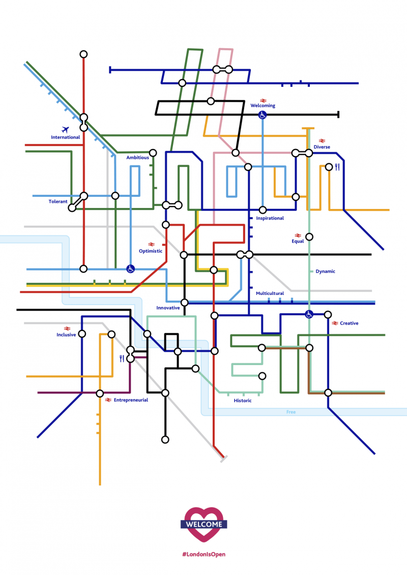
The concept behind this piece, is a typographic interpretation of the hashtag that is leading the campaign. It is constructed in the style of the the London Underground map. The station names used are adjectives extracted from the campaign description and a survey ‘Words that best describe London’ by YouGov in 2013. These words come together to describe the diverse and ambitious city that we are grateful to be able to work in.
We have used the official Underground Pantone colours, and included icons to symbolise different businesses (e.g. food and drink icon), equality (disabled icon) and a plane icon to demonstrate the international and inclusive nature of the city. The design is finished off at the bottom with an adapted Underground heart logo containing the word “WELCOME” and replacing the red with the London is Open campaign magenta.
We support #LondonIsOpen.